Hey everyone. Today is my last card of the year featuring products from Brea Reese. It has been a pleasure working as a design team member for the Momenta/Brea Reese family and I’m so honored. The members of Brea Reese are amazing and I wish them continued success. This won’t be the last time you see me using their products for sure.
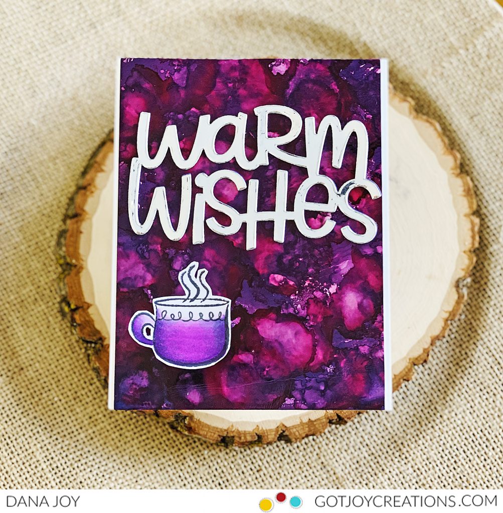
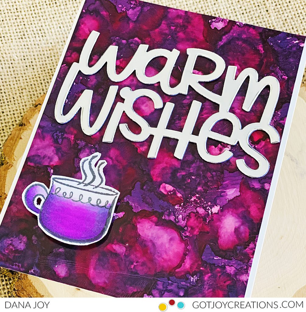
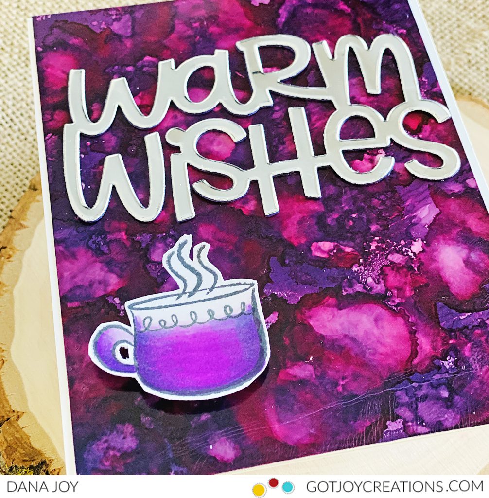
My card is featuring a purply-pink galaxy background. I love the way Brea Reese alcohol inks move so beautifully on paper. You can never repeat the same design and that just amazes me. I kept my card clean and simple by letting my background be the start. Using a large sentiment from Hello Bluebird and just a small hot cocoa mug was all I needed to complete this card.
I would love to see your designs using Brea Reese alcohol inks. Make sure to tag me on IG (mzdanajoy) so I can see what you have created. Have a great day everyone. See you back here soon.